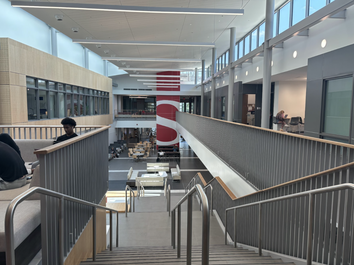
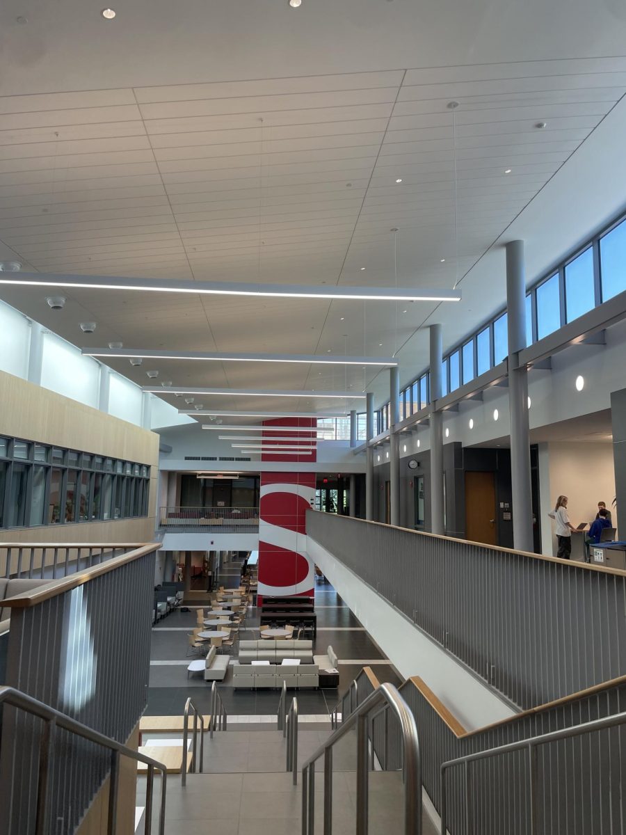
As students came back to campus this year, they were greeted by an almost completely renovated Upper School. This new addition includes a new cafeteria, new classrooms, and new study spaces. The new classrooms are specific to the science and art departments, making sure that their new spaces will help students develop and learn more efficiently. We interviewed teachers and discovered their perspective on how this whole process has affected their teaching these past couple months.
For the Science Department, we spoke to Ms. Fusina – a Chemistry teacher and the Science Department chair. She told us that the science department was able to, “from the beginning, work with the architects to really design the classrooms exactly how we wanted them.”
This helped the teachers to create a classroom designed specifically for what they and their students needed most. The physics room, for example, has the ability to hang bowling balls to the ceiling, and extra space for model labs, while the Chemistry rooms have things like fume hoods, and extra sinks.
Ms. Fusina told us that in the cottages last year, there were only two sinks per room. In the new space, there are two sinks per table. Because of this, the new space allows for more efficient and productive learning. She also told us that “[they] built them for collaboration, for lab work, [and] to really engage with the material as much as possible.” So, she hopes that quick labs and hands-on materials will be easier to access because students won’t have to move from a desk to a lab. “We’re already sitting in that collaborative space,” Ms. Fusina said. These classrooms are truly made for the benefit and learning of every student.
Ms. Fusina also spoke on the differences between the classrooms, saying that they “didn’t have to design one science room,” but that they were able to look at each science’s specific needs.
The classrooms are equipped for their uses particularly. However, there are also two new general science classrooms, which “opened up the possibilities for rooms for electives or physical science.” These rooms are not designed specially for a class, but are the perfect space for a class that would have been previously put into “whatever room was available.” She told us that a positive aspect of the new classrooms is the space, stating that there is “a lot more movement around the room.”
While they are still getting used to their new space, Ms. Fusina told us that “hopefully it really allows students to engage with the content more and more authentically.”
The art department also faced a big change with the new building. Towards the end of the 2023-2024 school year, they had to manage packing and organizing supplies in preparation for the new space while simultaneously teaching classes. Ms. Elkins is the chair of the arts department and she had a big input on the design of the new art wing. She thought of how to benefit 2D, 3D, and graphic design. She says, “We had a clear vision of what we wanted for the Saints art community, [including] focusing on maximizing natural light and taking advantage of the beautiful south-west-facing views. We also wanted to maximize studio space. Since we have an open studio policy, we needed room not only for students to spread out during classes but also for students working on projects during their free periods.”
When they were working with architects, the art department wanted to focus on making the space very open, and taking advantage of all the natural light. For 3D art, the space was designed to be open so they can switch between ceramics, woodworking, and stained glass. Over the years, the ceramics program has grown, so now they have a state of the art kiln and glaze room. Students in art classes have been able to really enjoy the space. There is so much space to spread out and work on a project without being affected by what is happening around you. Graphic design also has their own space so they are not affected by what 2D or 3D art is doing.
Ms. Elkins adds, “It was important to separate graphic design spaces from areas where students are painting in oils—no one wants cadmium red paint on their laptop! The graphic design room also needed lots of outlets and other technical features. We also needed space for framing, since we frame everything in-house. Now I’m able to frame work in the graphic design studio, even while Mr. Bunnell and Mr. Riley are teaching in the other studios.”
Students have agreed that the new building has had a positive impact on the school community. In a form sent out, some negative feedback was that lunch lines can be chaotic, and that the space doesn’t have much life due to its mostly gray and tan color scheme. However, students have done a good job of keeping the space clean, and students seem appreciative of the new space. Overall, it has been a positive addition to the school!
